What to consider designing for print
As professional or amateur graphic designer you might have very clear design in mind when you start you next project. But are there things you should consider when your design project is destined to be printed? YES!
Many very creative persons give their imagination a free reign while working on design projects. And why shouldn't you? You definitely should show the world your creativity! We're going to discuss few things to keep in mind so your artwork will look as perfect on print as on your computer screen.
Of course there are many more things to consider, but here are some things we come across in our everyday work with reviewing artwork before sending it to print.
- 1. File Resolution
- 2. CMYK color model
- 3. Cutting tolerance
- 4. What paper is your artwork going to be printed on?
- 5. Contrast, small (or rather very small) design elements, color saturation
- 6. Do you want people to be able to read it?
- 7. Print template and bleed
1. File resolution
As most of you know, one of the main differences between web (computer screen) and print graphics is file resolution. Web projects only require 72 dpi resolution at actual image size since increasing resolution will not get you better quality of displayed image but it will increase your image size which may slow down your website.
Printing, on the other hand, requires at least 300 dpi resolution at actual print size (your image may have 72 dpi resolution but be much bigger dimensions-wise).
What to consider - all elements of your artwork should have 300 dpi! If you use 3 images in your artwork - 2 images with 300 dpi and 1 image with 72 dpi, they will all look great on screen, but image with 72 dpi will look pixilated (read "bad") on print.
There are many discussions on the web whether 72 dpi is a meaningful number, but we want to keep it simple in this article, so I hope you got the idea - at least 300 dpi resolution for print projects!
2. CMYK color model (short for cyan, magenta, yellow, and key (black) and often referred to as process color or four color)
Your artwork designed for print should use CMYK color model! Don't use RGB!
If you have to convert RGB colors into CMYK after your project in completed, colors you used may change SIGNIFICANLY (for example, bright vibrant pink may change into very dull pink color)! It's important to start your design project using correct color model.
In some situation you can use limited number of PMS (Pantone Matching System) colors. (For example, we offer printing with 1 or 2 PMS colors for our custom envelope orders). It never makes sense to print with PMS colors if your artwork has more then 3 colors. CMYK colors allow you to use any colors while spot colors limit you to use few colors only.
3. Cutting tolerance
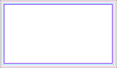
Always keep in mind that after your artwork is completed and prepared for printing according to your print shop specifications, it will be printed in print shop and then cut with automated mechanical knife. Different equipment has different cutting tolerance. 1/16" is pretty common. You can see approx. equipment tolerance in printing template - it's a width of safety zone (width of area between blue and pink lines in the sample).
Anything you place outside safety zone - photo images, font, borders - can be cut off! It also means that any borders, arcs, close to safety zone edge artwork may look uneven/not symmetrical if you don't think about safety zone while designing your artwork. Here are some samples.
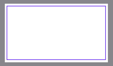
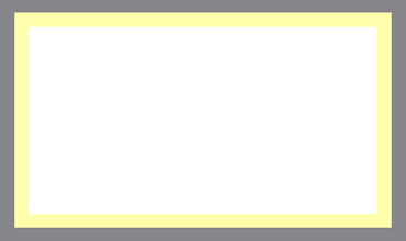
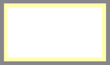
Sample 1. Your artwork has a thin border near the edge of safety zone (purple border in the sample). Everything looks perfect on a screen and when you print a sample on your desktop printer:
Artwork in the template (everything looks good):
Sample printed on desktop printer - looks perfect (Gray background shows printed card's edge):
Order received from print shop: As you can see, left edge is too narrow and card edges are not symmetrical. But print shop did nothing wrong in printing and cutting your job. Shift is within cutting tolerance of the equipment. (Gray background shows printed card's edge)
Solution - Avoid this type of borders altogether!
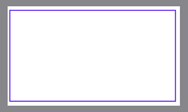
Sample 2. If you want your artwork to have borders near the safety zone, make sure the borders go all the way to the edge and are at least 0.25" wide. This way edge shift within cutting tolerance values will be barely noticeable!
Artwork with border:(Gray background shows printed card's edge)
Order received from print shop (you will be probably the only person who will notice the same shift as in previous example): (Gray background shows printed card's edge)
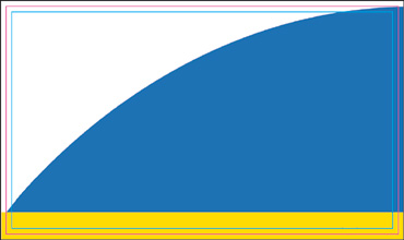
Sample 3. Curves
You have to give cutting tolerance a special consideration if your artwork contains curves.
Artwork:
The idea is to have top right end of blue curve to meet top right corner of the card, and bottom left end of the blue curve to meet left edge of the card. It's very unlikely to happen in real world.
Range of Results:
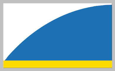
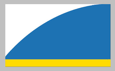
And while shift is not obvious in each individual card, the results are not expected.
4. What paper is your artwork going to be printed on?
Uncoated paper vs. Coated Paper
Uncoated papers absorb ink during printing process differently from glossy papers. They also reflect light differently so if you print the same artwork on coated and uncoated papers, you may get significantly different colors! If colors are very important for you, request hard copy proof (if available) or place a small order first to make sure colors are exactly what you want.
Any lamination or coating
Any laminations or coatings are likely to slightly change your artwork colors - both color of paper and colors of inks. If colors are very important for you, request hard copy proof (if available) or place a small order to make sure colors are exactly what you want.
UV Lamination
UV lamination makes your printed product water and tear resistant, thicker, sturdier and more substantial. Keep in mind that you can't write or print on UV lamination! So if you need ability to write or print on your printed product, order product with aqueous coating, silk lamination or uncoated paper. Many products are available with UV coating on front side and aqueous coating on back side. You can't apply foil accent or embossing to UV lamination But you don't need to apply UV coating to the entire side; you can enhance your artwork appearance with spot UV lamination.
Silk Lamination
Silk lamination is a great finish for many products - it makes your product tear and water resistant, and gives it a nice soft silky finish. But keep in mind that silk lamination may make dark colors of your artwork dull. Always request hard copy proof (when available) or place a small order before placing an order for big quantity to make sure the colors come out the way you want.
5. Contrast, small (or rather very small) design elements, color saturation
Always print a sample of your artwork on your office/home printer before sending order to print shop! Of course there is a huge difference between quality of home/office ink-jet printer and offset press, but when you print your artwork you may notice things you don't see on the screen. When you design business card or small postcard, you see your artwork on your monitor at much more then actual print size. So you will see every little tiny detail very clearly. Dark grey color and dark-dark grey color will look very distinguishable from each other even when they are next to each other. The awesome grey background pattern you spend a lot of time designing will look great on dark grey background. But when you print you artwork, all this tiny details may disappear because they are just too small.
So it's a good idea to always print a sample!
6. Do you want people to be able to read it?
- Make sure fonts are large enough to read even for people who don't have perfect 20/20 vision or magnifying glass.
- Make sure text is readable - don't use fonts too fancy so people will have hard time to distinguish g and q!
- Print your artwork in black and white to see if there is enough contrast between colors to read text in black and white. There are more people than you think who may have difficulties reading content with low contrast between colors!
- Print a sample and ask few people to read what your card says. See if they have any problems doing this.
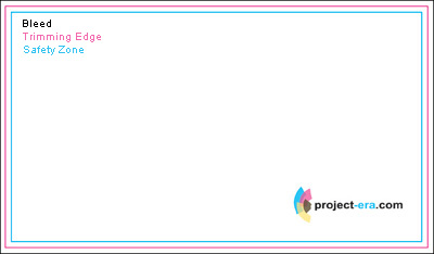
7. Print template and bleed
Before you send your print-ready artwork to a professional printshop, you have to place it into a template. Print template is usually looks like this:
Safety Zone - All text and important graphics (for example, logo) should be inside safety zone since anything outside safety zone can be cut.
Trimming Edge - Approximate line where your artwork is going to be cut. I wrote "approximate" because cutting equipment has cutting tolerance and you should consider it while designing your artwork.
Bleed - even if your artwork doesn't run to the very edge of the paper, you will be asked to add bleed in your artwork. Most of professional printshops use full bleed printing. Full bleed printing is printing from one edge of the paper to the other without the standard borders by which most personal printers are limited, so to insure there is space for cutting paper, your artwork should extend beyond cutting edge, even if you don't need anything printed there.
If you don't include bleed into your design at the very beginning, you might have problems preparing your artwork for printing. All background artwork should be extended beyond the printing edge.
How big is bleed area? Usually it's 0.1" or 0.125" added to each dimension. So your 3.5"x2" business card should have 3.6"x2.1" or 3.625"x2.125" artwork size.
We have printing templates for most of our products. Download a template for your product to see the size of bleed area.